S&P Global: CIQ PRO Dashboard
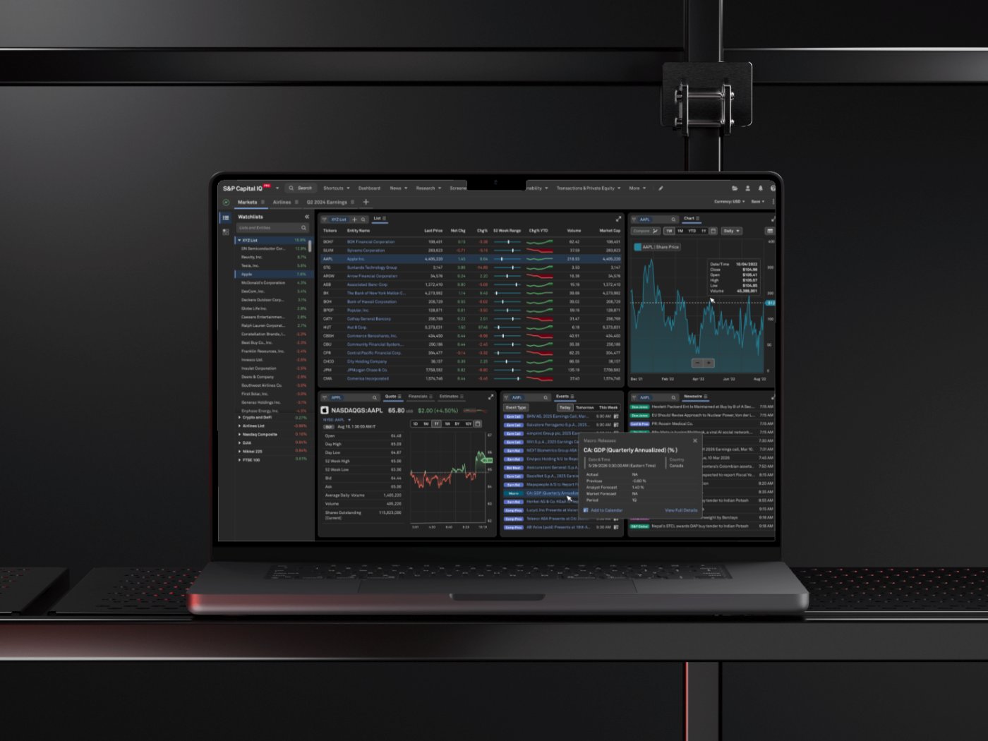
How I turned a static dashboard into a personal command center and made widget setup 70% faster
The screen analysts opened first every morning was the one screen they couldn't change.
Sole designer on the dashboard revamp: the widget system, the add-widget flow, list management, and per-widget settings, built with the design-system and platform teams.
Role
UX Designer
Category
Financial Intelligence
Timeline
2024 to Present
3×
More widgets added per user
85%
Task success rate
+28
Point satisfaction lift
-40%
Setup support tickets
“A dashboard that finally works the way analysts do, fast, flexible, and fully their own.”
Client feedback
Overview
The contextCIQ Pro is a financial intelligence platform used daily by financial analysts to monitor markets, track companies, and manage watchlists. The dashboard is the heart of the product, it's the first screen analysts see and the workspace they return to throughout the day.
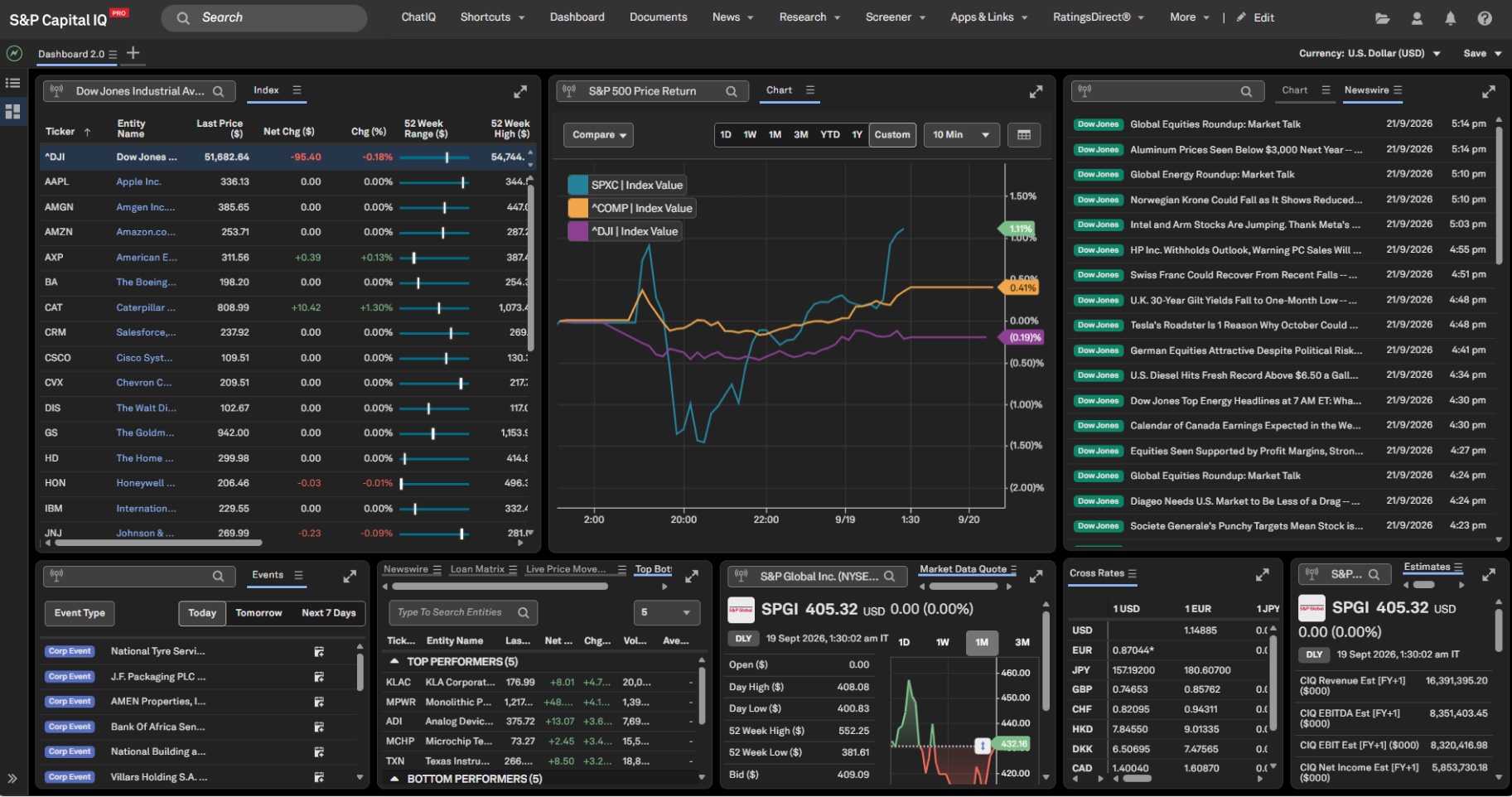
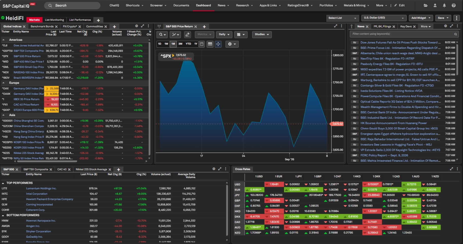
Over time, the old dashboard had fallen behind. Its widget system was rigid, its list management was clunky, and its visual language no longer matched the rest of the product. This project was a ground-up revamp of the dashboard: rebuilding the widget experience on a new design system, streamlining how analysts create and manage lists, and giving users far deeper control over personalizing their workspace.
Challenge
The problemResearch and feedback from existing users surfaced a consistent set of pain points with the old dashboard:
Adding widgets was difficult.
Users struggled to discover, add, and arrange new widgets on their dashboard. What should have been a quick action felt buried and unintuitive, which discouraged analysts from tailoring the dashboard to their workflow.
List management was broken.
Creating a new list and adding it to the dashboard involved too many steps and too much friction. Since lists (watchlists, screeners, tracked companies) are central to how analysts work, this friction hit the core of the daily experience.
Widgets were outdated.
The widgets were built on an older visual system, lacked modern features, and offered little to no configuration. Analysts couldn't adjust a widget's settings to show the data the way they needed it.
Limited personalization.
Analysts work in very different ways, some focus on a handful of companies, others monitor entire sectors. The old dashboard treated everyone the same, offering few options to shape the workspace around individual workflows.
The core problem: a dashboard meant to be a personalized command center felt static, rigid, and hard to shape.
Approach
The processRedesigning the widget system on the new design system.
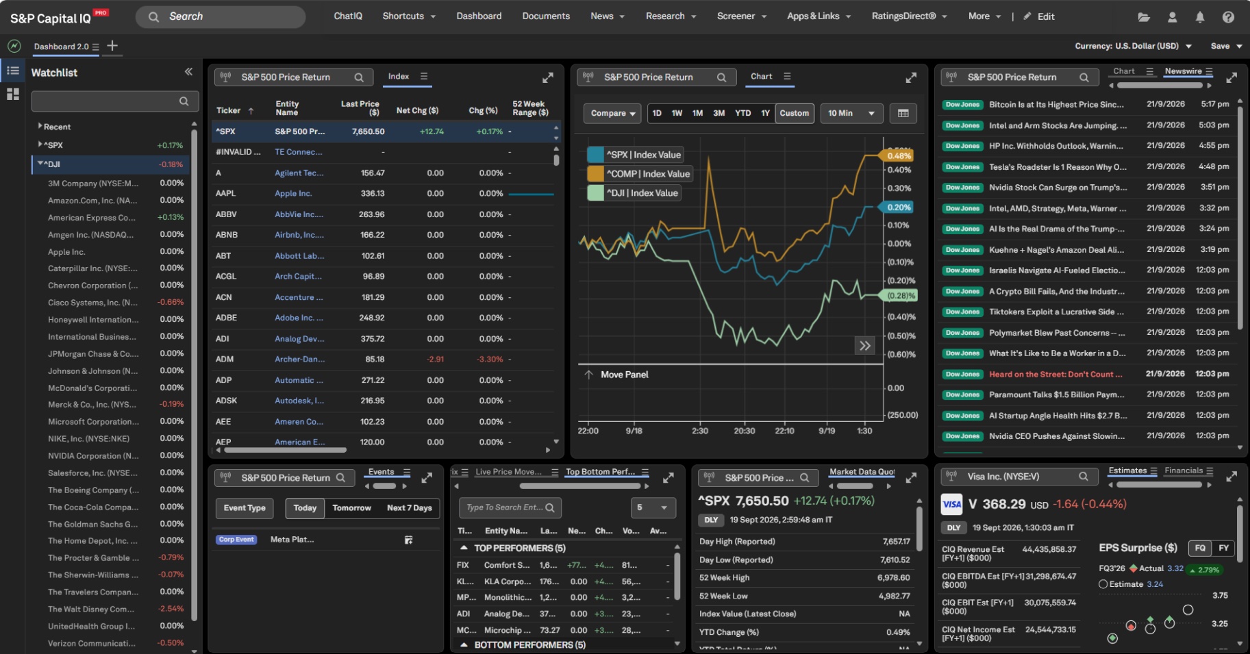
Every widget was rebuilt from the ground up using the new design system, consistent typography, spacing, iconography, and interaction patterns. Beyond the visual refresh, each widget gained new features and richer data presentation, making them genuinely more useful, not just better looking.
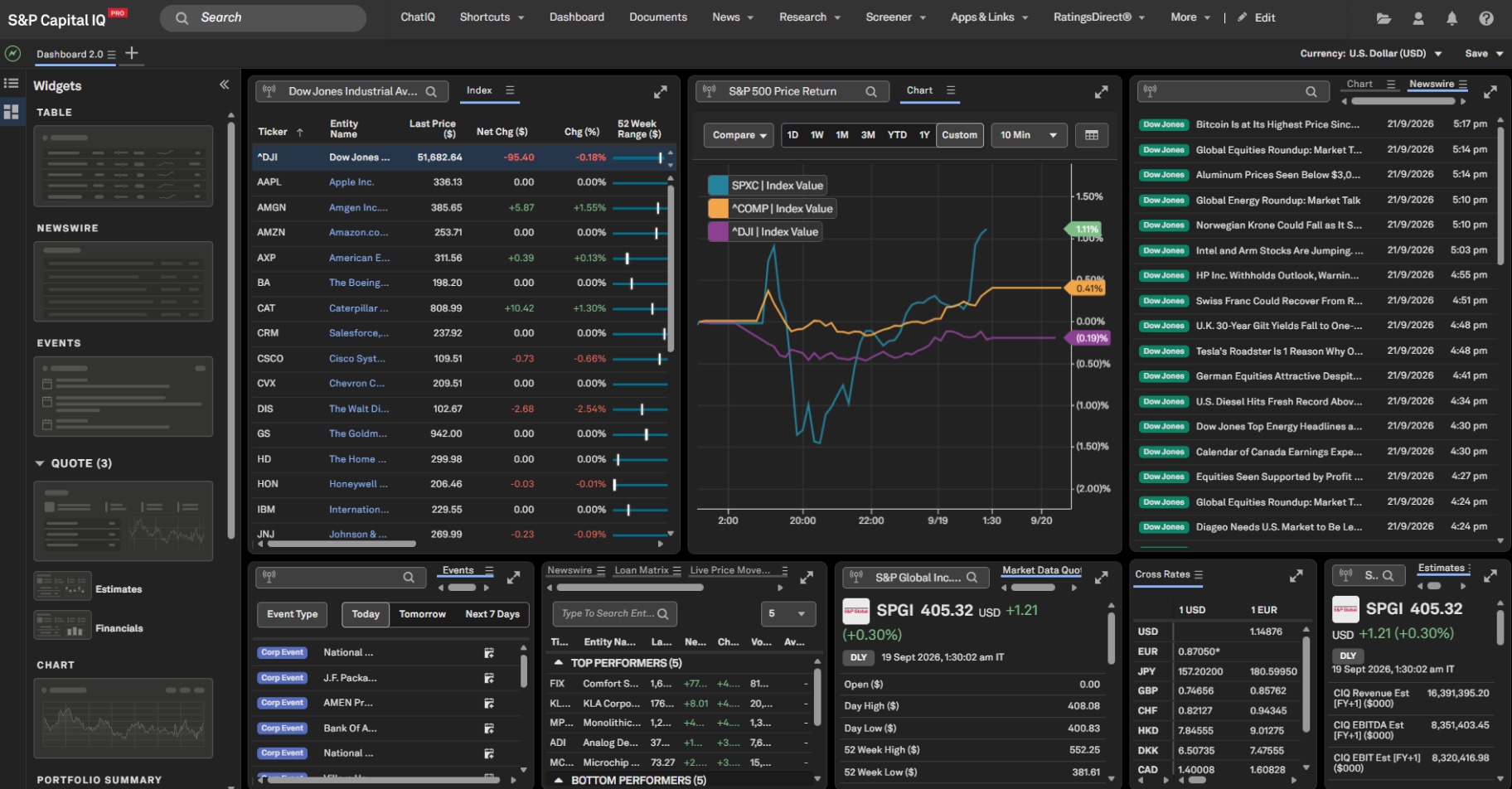
Making it effortless to add widgets.
The "add widget" flow was completely rethought. Analysts can now browse and add new widgets to their dashboard in a few clicks, with clear previews of what each widget does before adding it. What was once a source of frustration became one of the fastest actions in the product.
Simplifying list creation and management.
Creating a new list and adding existing lists to the dashboard was streamlined into a simple, direct flow. Analysts can now view multiple lists side by side on the same dashboard, a major workflow improvement, since comparing and monitoring several lists at once is a daily need for financial analysts.
Per-widget settings.
Every widget now has an easy, accessible settings panel. Analysts can configure what data a widget shows and how it displays it, right from the dashboard, without digging through menus.
Deep personalization.
The new dashboard gives users extensive options to personalize their workspace, choosing widgets, arranging layouts, configuring settings, and surfacing the lists that matter most to them. For financial analysts, whose value depends on seeing the right information at the right moment, this flexibility is not a nice-to-have; it's essential.
Outcome
The resultThe redesigned CIQ Pro dashboard transformed a rigid, one-size-fits-all screen into a flexible, personal command center:
Adding widgets went from a pain point to a seamless, self-serve action.
List creation and management became fast and intuitive, and analysts can now monitor multiple lists simultaneously, significantly speeding up their daily workflow.
Redesigned widgets brought the dashboard in line with the new design system while adding new features and configurable settings to every widget.
Personalization options let each analyst shape the dashboard around their own workflow
the single most requested capability from users.
The result is a dashboard that works the way analysts do: fast, flexible, and fully their own.
Key learnings
What I took awayPersonalization beats one-size-fits-all, letting analysts choose and arrange their own widgets mattered more than any single visual refresh.
Friction hides in the small flows, streamlining list creation and the add-widget flow removed more daily pain than rebuilding every widget did.
Migrate the whole system in one pass, rebuilding every widget on the new design system together kept the dashboard consistent, not just prettier.
Put configuration next to what it configures, per-widget settings only got used once they lived on the dashboard instead of a buried menu.
More projects
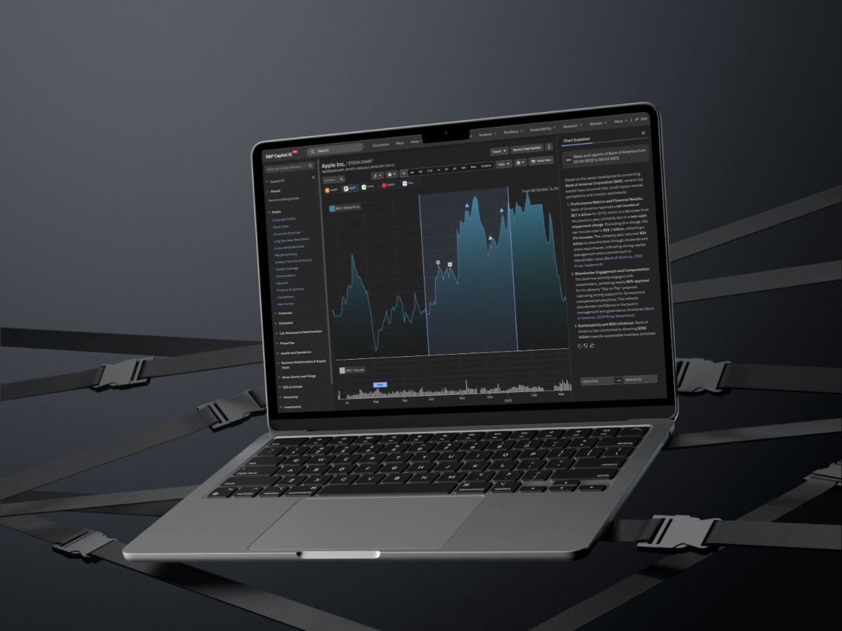
S&P Global: Chart Explainer
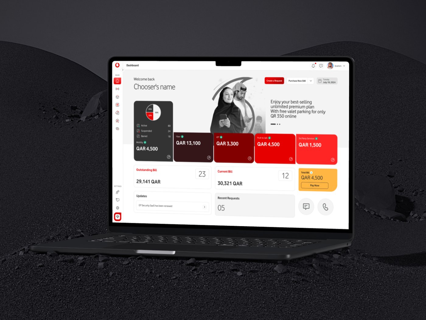
Vodafone Qatar: Agent Platform
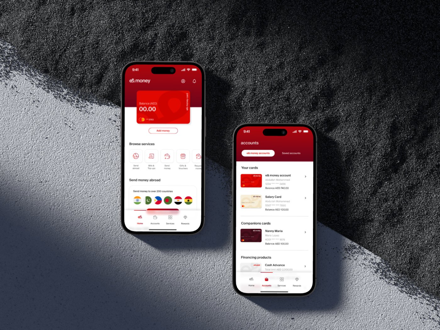
Etisalat: e&money
Contact me
Let's work together
Have a project in mind, or just want to say hi? I'm always open to new conversations.