S&P Global: Chart Explainer
How I put the story behind a price chart on screen and cut chart-to-explanation time by 71%
A price chart shows an analyst exactly what happened, and never once why.
Product designer on Chart Explainer: the panel concept, mapping events onto the chart timeline, and the citation and trust patterns, with the ChatIQ platform team.
Role
Product Designer
Category
Financial Intelligence
Timeline
2026
3.1×
More sessions continuing into ChatIQ
4.5/5
Analyst trust score for cited explanations
58%
Pilot analysts using it weekly or more
500M+
Licensed documents cited, never the open web
“Trust isn't a disclaimer, it's an interaction pattern.”
Client feedback
Overview
The contextCapital IQ Pro is S&P Global's flagship platform for financial professionals, financials, estimates, filings, transcripts, news and research in one place. Charting is one of its most-used surfaces: analysts live in price charts, valuation multiples, and peer comparisons every day.
But a chart is only half the story. When an analyst sees a price spike or two peers diverging, the chart doesn't say why, finding out means leaving the chart to search news, filings, and transcripts and stitching the narrative together by hand. Chart Explainer, part of the broader ChatIQ intelligence layer, answers 'why did this happen?' right on the chart.
Challenge
The problemIn our ChatIQ research, analysts told us the most common trigger for a research session was something they saw on a chart. Yet explaining a single movement broke the workflow:
Manual, guessed searches
Explaining a move meant guessing a date range and searching news by hand, then cross-referencing filings and earnings transcripts one by one.
Lost chart context
Verifying each claim meant leaving the chart, and losing the very context that prompted the question.
Repeated for everything
The same 20-40 minutes of tool-switching repeated for every anomaly, every peer, every day, quietly eroding flow and trust.
The chart raises the question; answering it breaks the workflow. How might we let analysts ask 'why did this happen?' directly on any chart and get a plain-language, source-cited answer without ever leaving it?
Approach
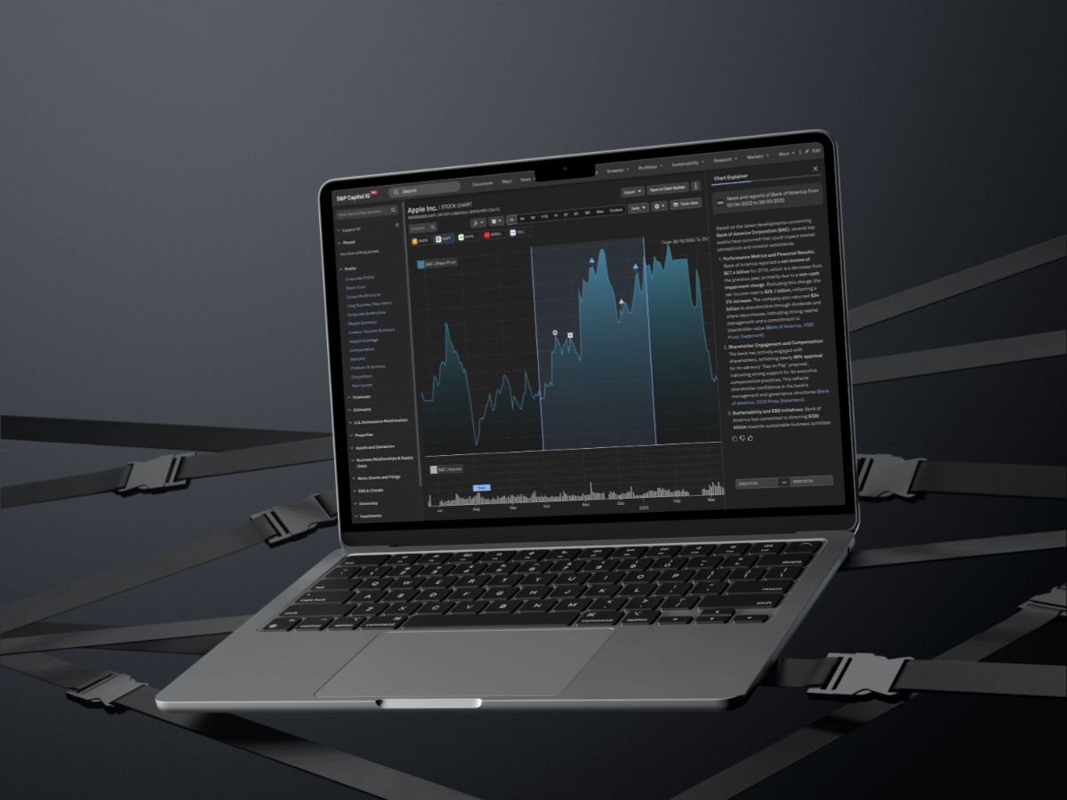
The processExplain This Range
Analysts brush-select any date range (or click a spike) and hit Explain, Chart Explainer generates a plain-language narrative of what drove the movement in that window. Testing showed analysts think in ranges, not single points, so range-select became the default gesture.
Event annotations on the chart
Confirmed catalysts, earnings, ratings actions, M&A, guidance changes, macro releases, are pinned directly onto the chart as numbered markers, each linked to its explanation point. Markers first, narrative second, matched how analysts actually read.
Snippet-level citations
Every sentence cites the exact source snippet, broker research, filings, transcripts, and news from S&P's licensed content sets, never the open web. One wrong attribution is a career risk, so the trust bar matched the rest of ChatIQ.
Driver confidence tiers
Explanations separate confirmed events (filed, dated, verifiable) from coincident context (market-wide moves, sector rotation), so analysts never mistake correlation for causation. A visible 'no clear driver' state, instead of a stretched explanation, actually increased trust in the answers it did give.
Continue in ChatIQ
Every explanation is a doorway: analysts hand the annotated chart into ChatIQ and keep interrogating it ('compare this drawdown to peers', 'was this priced into estimates?') with full context carried over.
Outcome
The resultValidated in 8 moderated usability sessions on analysts' own live charts, not demo data, then piloted:
71% faster from a chart anomaly to a defensible explanation
roughly 25 minutes of manual research down to about 7.
3.1× more chart sessions continued into a ChatIQ follow-up query, with context carried over.
4.5/5 analyst trust score for chart explanations with citations.
58% of pilot analysts used Chart Explainer weekly or more within the first month.
Chart Explainer proved the thesis behind the whole intelligence layer: trust isn't a disclaimer, it's an interaction pattern. By anchoring every claim to a point on the chart and a snippet in a source, we made the answer defensible enough to put in front of a client.
Key learnings
What I took awayCiting the source moved trust more than the answer did, snippet-level citations built more analyst confidence than accuracy alone.
Analysts think in ranges, not points, defaulting to brush-select over single-click anomalies matched how people actually read a chart.
Say 'no clear driver' out loud, admitting uncertainty when there wasn't a confirmed catalyst built more trust than a stretched explanation would have.
Frame every answer as a doorway, not an endpoint, tying explanations into ChatIQ follow-ups tripled continued engagement.
More projects
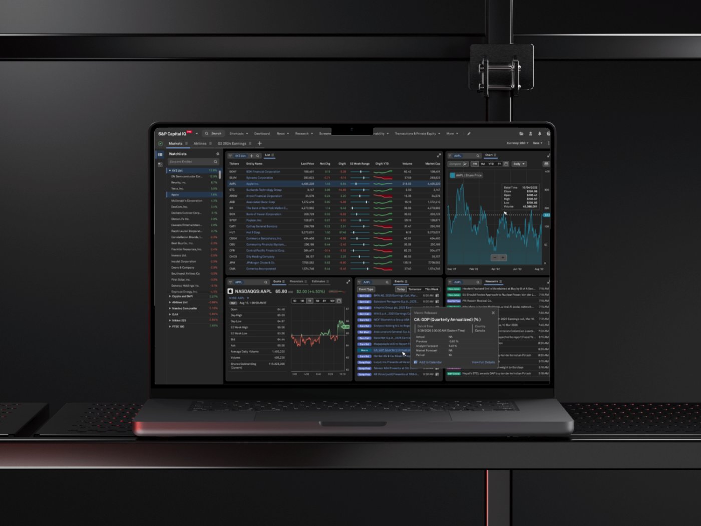
S&P Global: CIQ PRO Dashboard
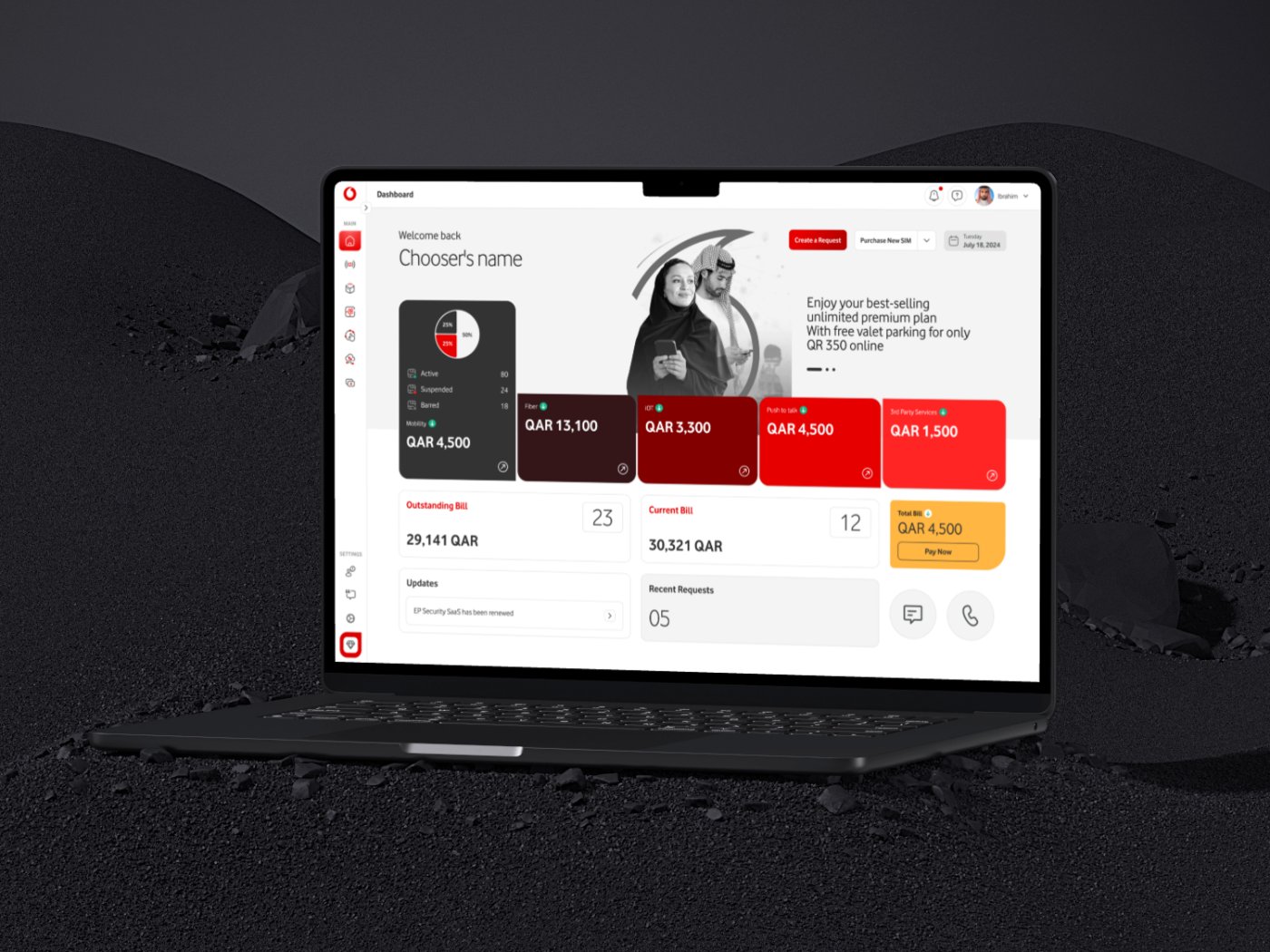
Vodafone Qatar: Agent Platform
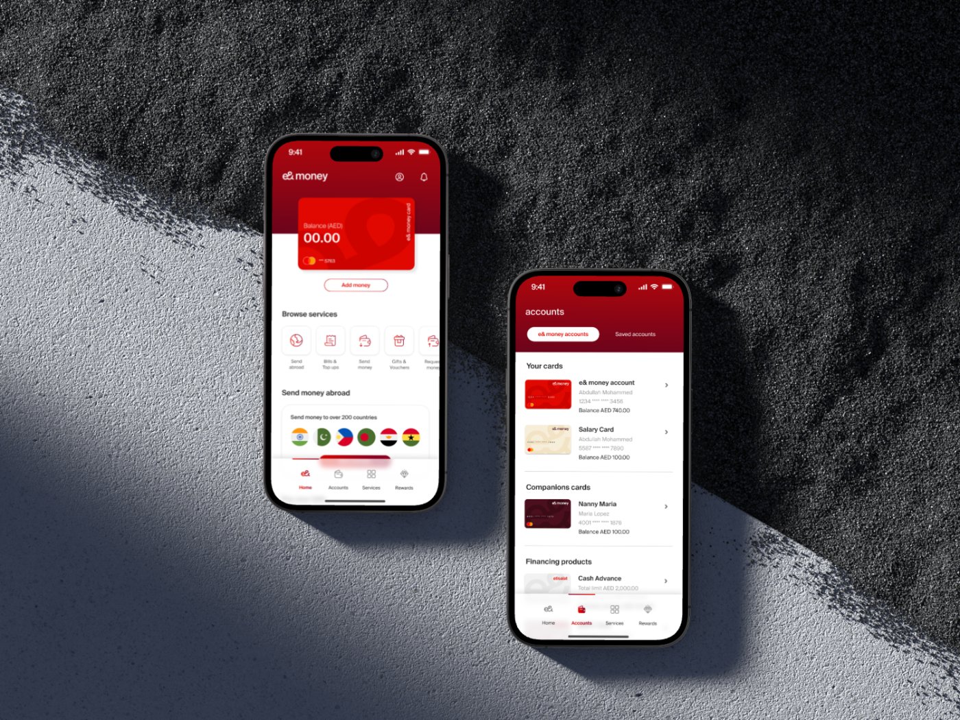
Etisalat: e&money
Contact me
Let's work together
Have a project in mind, or just want to say hi? I'm always open to new conversations.