Sarmaaya
How three weeks of research turned an information website into an app first-timers would actually invest with
86% of the people I surveyed had never invested. 82% said they would, if someone guided them.
I ran the research sprint (450+ survey responses, 10+ interviews, 3 personas) and designed the app end to end, from wireframes through the atomic design system to usability testing.
Role
Product Designer
Category
FinTech / Investing
Timeline
2023
450+
Survey participants
10+
User interviews
3
User personas
1
Atomic design system
“Meet users where their knowledge is, guide them at every step, and let research drive the product.”
Client feedback
Overview
The contextSarmaaya Financials had a website full of financial information, but no platform where people could actually invest. With mobile rapidly outgrowing other devices, the company decided to make a mobile app its primary platform for future scalability.
Our objective: research, strategize, and design a mobile app with an easy-to-use interface, a one-stop shop for new and experienced investors to gain financial literacy, conduct research, and invest in mutual funds. The project ran a complete end-to-end process: a deep research sprint and persona building, through ideation, wireframing, and high-fidelity design, to moderated usability testing and iteration on real feedback.
Challenge
The problemDesigning for an audience that doesn't yet trust or understand investing:
Low trust, low knowledge
Research made it concrete: 86% of surveyed users had never invested in a mutual fund, and 49% considered limited financial knowledge a hindrance. Yet 82% were somewhat willing to invest if given proper guidance, the opportunity was real, but so was the confidence gap.
Users needed support at every step
People wanted help throughout the investment process, researched thoroughly before committing money, and preferred short video tutorials and live chat over email. Because money was involved, they expected extra security and authentication.
We were outsiders to finance
Coming from a non-finance background, the team had limited knowledge of the financial world, we had to become literate in mutual funds before we could design for them.
A crowded, uneven landscape
Local and international platforms each offered fragments of the experience, but no single product combined education, research, and investing in one approachable package.
The core problem: how might we turn hesitant, low-trust, low-knowledge users into confident first-time investors, on mobile?
Approach
The processA three-week intensive research sprint
We educated ourselves on markets and mutual funds, ran a stakeholder discovery workshop, carried out 10+ user interviews, surveyed ~450 participants, and mapped local and international competitors feature by feature.
Synthesizing insights into direction
We defined business goals, framed our 'how might we', and built three distinct personas, from experienced investors to complete beginners. Empathy maps and two mapped journeys (onboarding and first investment) surfaced pain points and emotional lows across every phase.
Prioritizing ruthlessly
We consolidated all requirements and sorted them with the impact-effort method, quick wins, big bets, fill-ins, and money pits, keeping scope focused on what would genuinely move users toward their first investment.
Ideating under time pressure
Facing a tight timeline, an extensive moodboard gave quick visual direction, and detailed user flows created a structured blueprint of every path, from guest-mode exploration to sign-up, fund discovery, and investment.
Wireframes, tested early
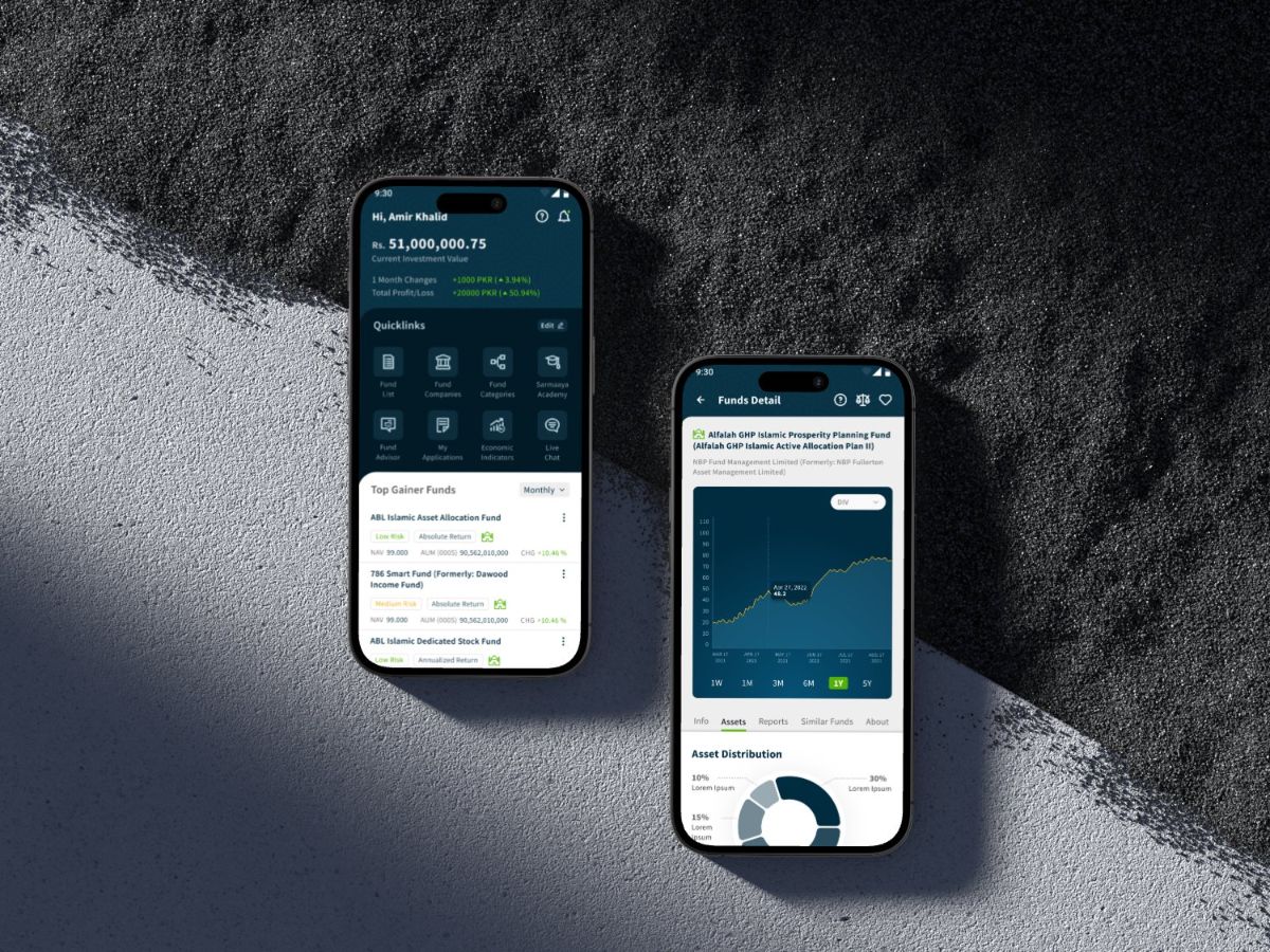
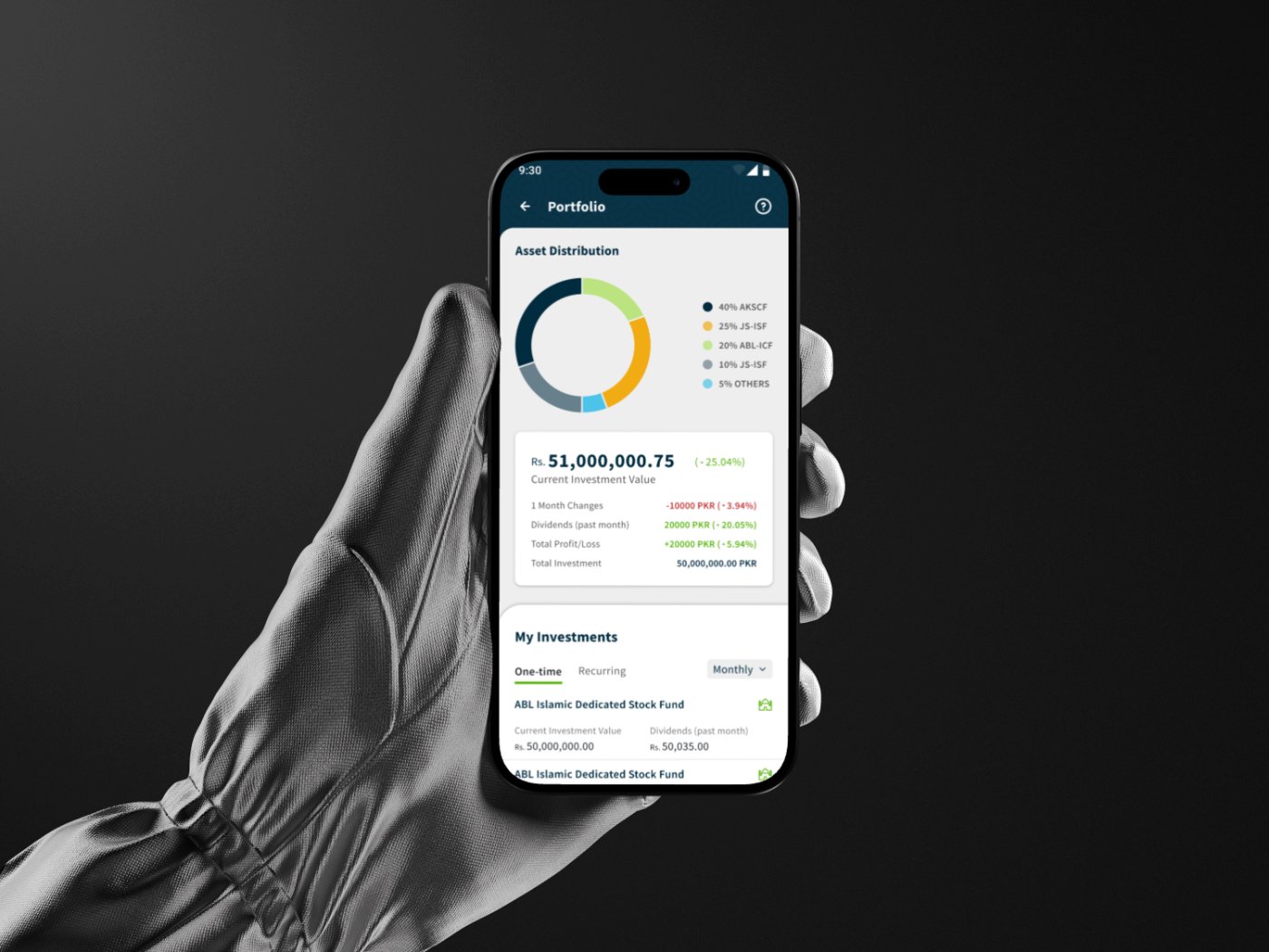
We built and tested core screens, dashboard, market, fund detail, portfolio, academy. Feedback drove concrete changes: a portfolio summary card, restructured tiles, removing the watchlist, and a quick-access navigation drawer.
Design refinement on an atomic design system
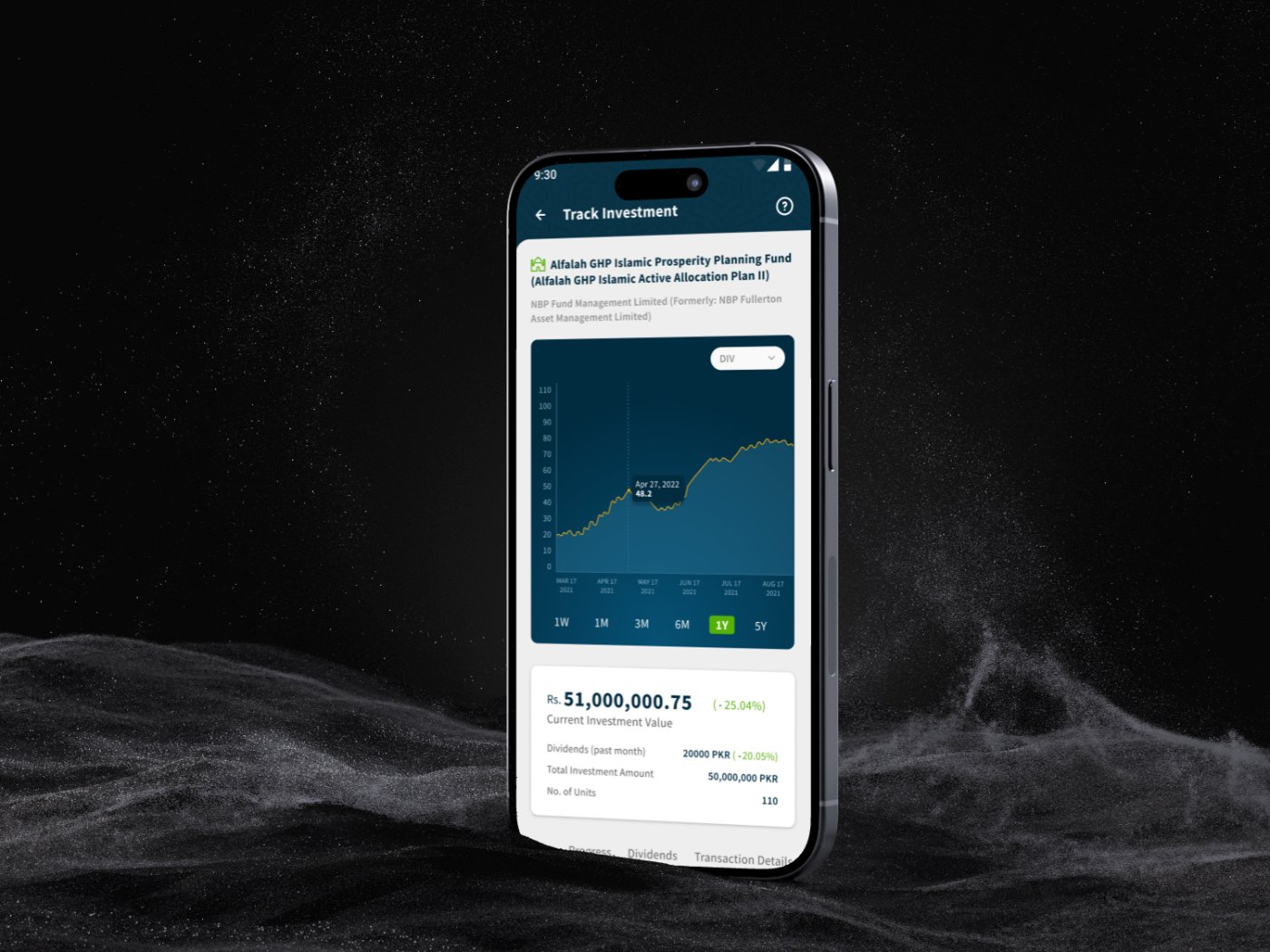
We built an atomic design system, components, modals, inputs, iconography, and applied it to high-fidelity designs across the dashboard, market, fund details, help center, and the full portfolio experience with fund progress, dividends, and transaction history.
Prototyping and usability testing
We connected the designs into an interactive prototype and validated it with moderated usability testing on goal-oriented tasks: register, self-educate, complete KYC, find and invest in a fund, and compare two funds.
Closing the loop on feedback
Testing shipped clear improvements: editable dashboard quicklinks, a verified badge confirming KYC status, and a help icon on every page after users struggled to find support.
Outcome
The resultSarmaaya went from an information website to a designed product where users learn, research, and invest, all in one place:
A complete, research-backed mobile investment platform for learning, research, and mutual-fund investing.
An experience shaped by 450+ survey participants, 10+ interviews, three personas, two mapped journeys, and moderated usability testing
every major decision traceable to a user insight.
Built for hesitant first-timers
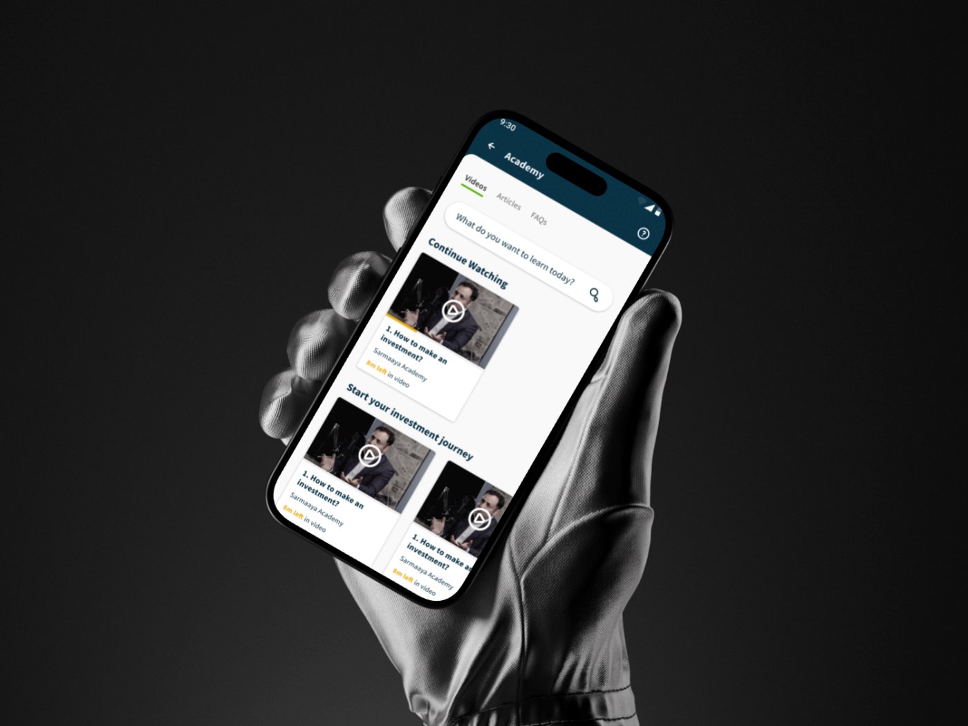
guided onboarding, a built-in academy with video tutorials, risk profiling, fund comparison, coachmarks, and an always-visible help center.
Validated and iterated
testing confirmed a user-friendly, visually pleasing experience, and every key piece of feedback was incorporated.
A scalable atomic design system to keep the product consistent as it grows.
Sarmaaya shows what it takes to design for trust: meet users where their knowledge is, guide them at every step, and let research, not assumptions, drive the product.
More projects
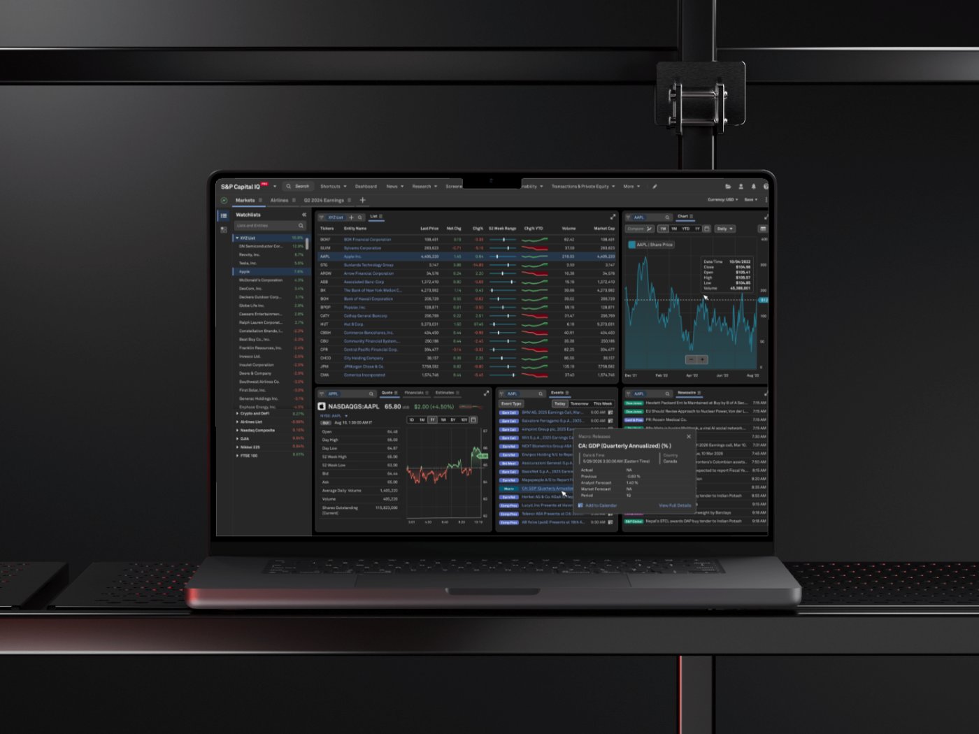
S&P Global: CIQ PRO Dashboard
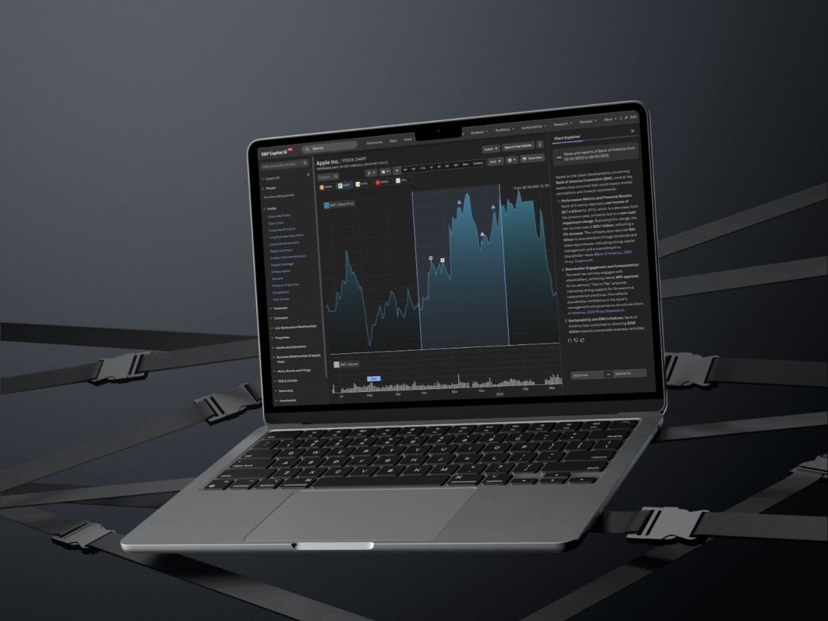
S&P Global: Chart Explainer
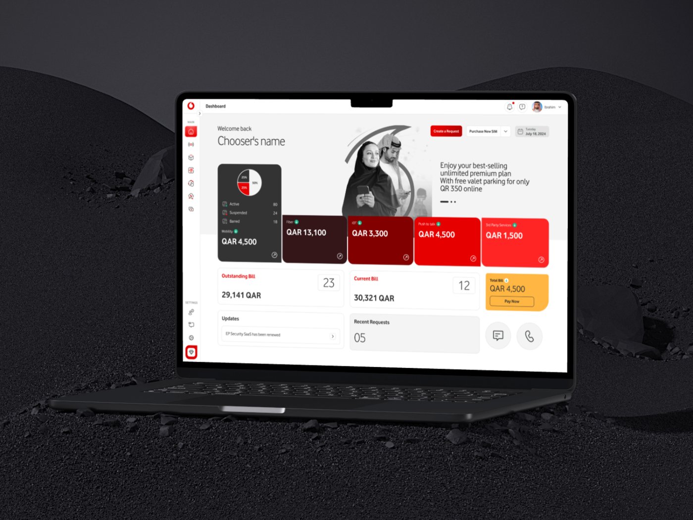
Vodafone Qatar: Agent Platform
Contact me
Let's work together
Have a project in mind, or just want to say hi? I'm always open to new conversations.