NBF: Design System
How I built a design system for a bank, from tokens to templates, and took it into Storybook
A bank only feels trustworthy when every screen speaks the same language.
Sole designer on NBF DS, a freelance engagement for the National Bank of Fujairah: foundations, components, organisms, templates and journey maps, plus working with the developer to bring it into Storybook.
Role
Sole Designer (Freelance)
Category
Design System · Banking
Timeline
Feb 2024 (v1.0)
16
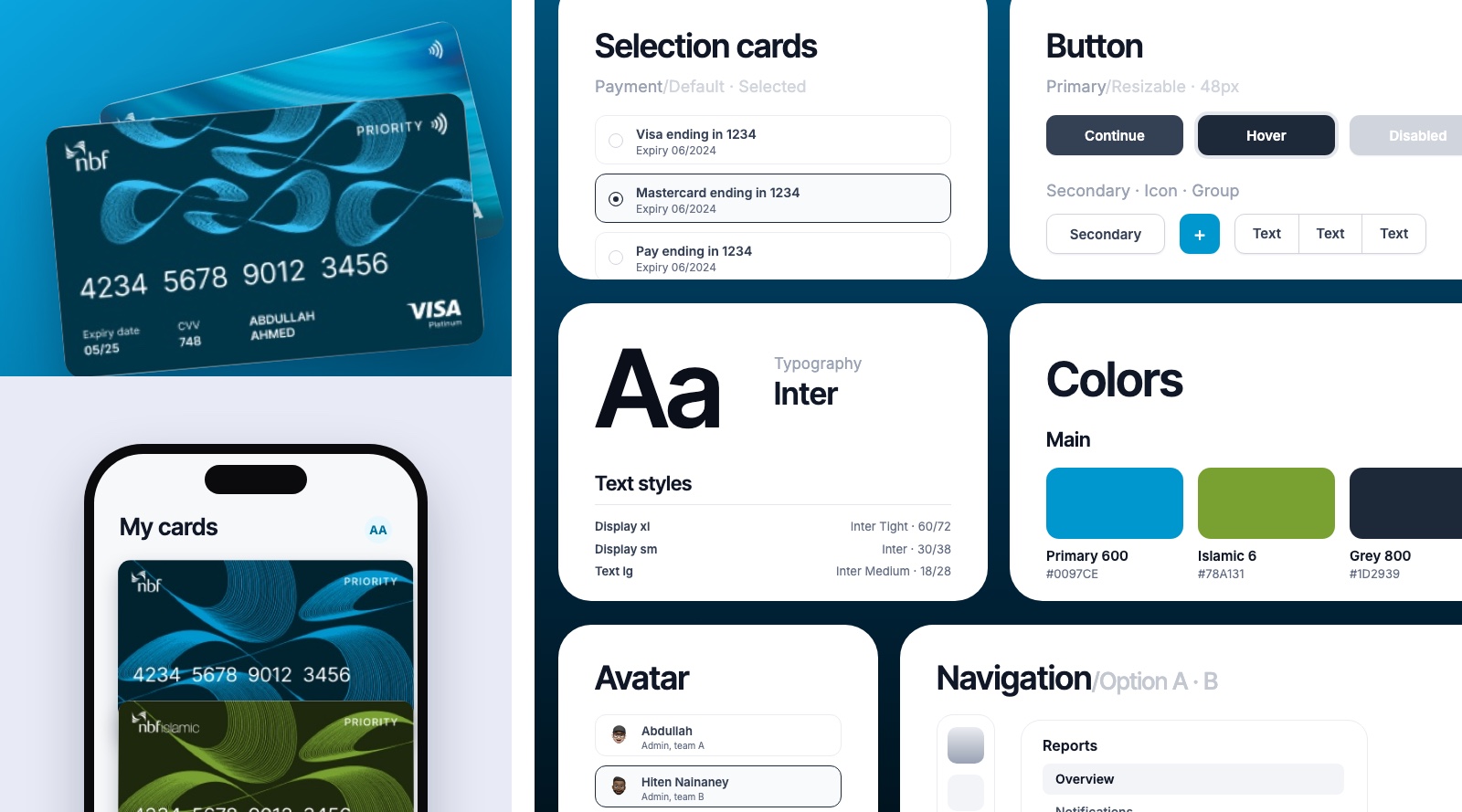
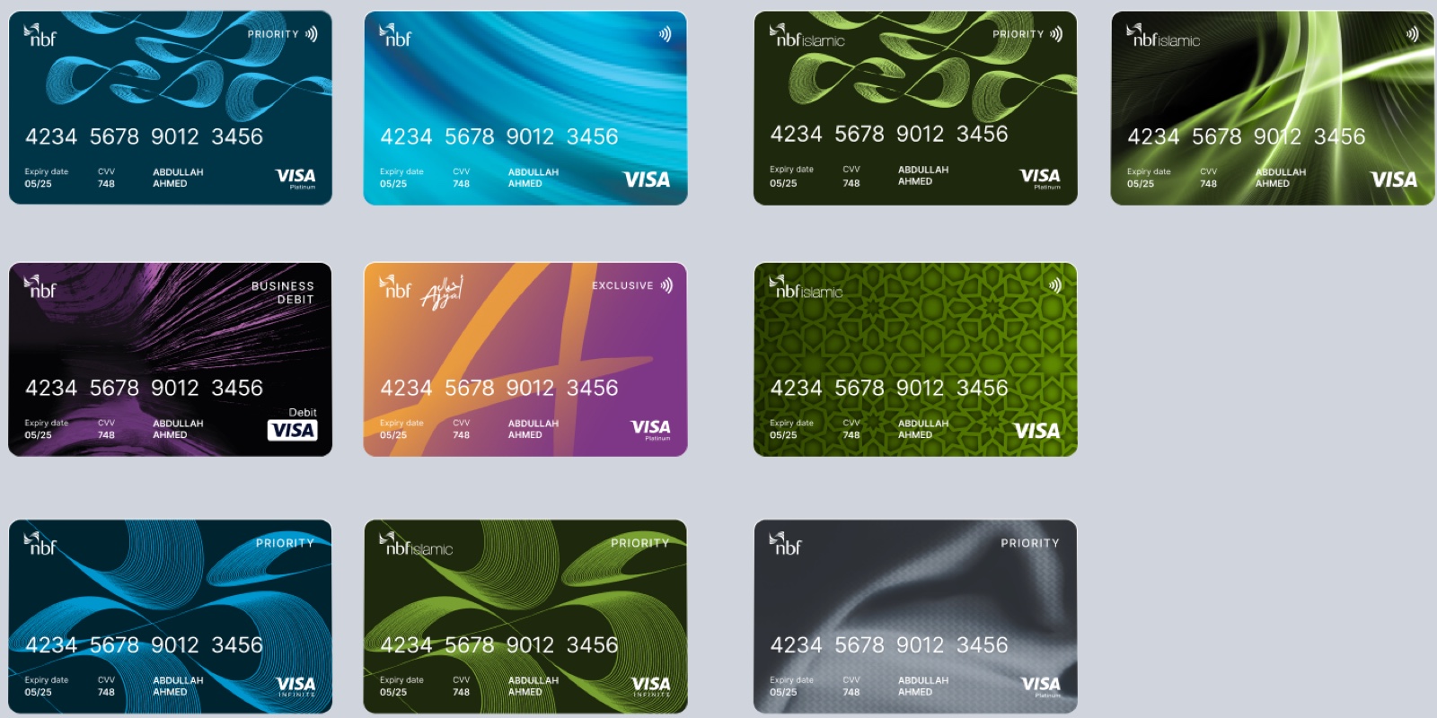
Bank card themes across both families
8
Sections, from Get Started to Journey Maps
1
Source of truth, from Figma to Storybook
v1.0
Released February 2024
“Built for the future. Available today.”
From the system's welcome page
Overview
The contextNBF DS is the design system for the National Bank of Fujairah (NBF). I worked on it as a freelance, sole designer: I owned the Figma library from the first token to the last template, and worked with the developer to bring it into Storybook.
A bank's digital experience reaches customers through many surfaces, from apps to the web. Without a shared language, each new screen re-decides the same colours, components and patterns, and design and code slowly drift apart. A design system standardises those decisions once and makes every future screen faster to build.
Version 1.0 was released in February 2024. It is organised so a team can start anywhere: Get Started, Design Guidelines, Foundation, Components, Organism, Templates and Journey Maps.
The System
How it's builtI used an atomic approach so the system could start small and grow piece by piece. Foundations come first, components are the atoms, organisms are sections assembled from them, and templates put everything together for real use cases.
NBF's visual identity does the rest of the talking. The card designs run in NBF blue and in a separate NBF Islamic green, so each product family keeps its own character while sharing one system underneath.
Design Tokens
FoundationsEverything visual starts as a named token in Figma. Colour comes in three families: a Primary blue scale, a separate NBF Islamic green scale, and a grey scale for text, borders and surfaces. Names stay predictable, like Primary/600 or Grey/900, so a designer can guess them and a developer can map them.
Type uses Inter, with Inter Tight for the largest display sizes, and is defined as named text styles from Display down to Text xs. Effects such as Shadow/xs and a 16px background blur, plus primary and grey gradients, are styles too, so nothing is hard-coded.
Components
Building blocksThe library covers the pieces a bank product needs: buttons and button groups, social buttons, avatars, video and image content, card designs, backgrounds, patterns and device mockups, plus an icon library of more than 1,100 named icons in 19 categories.
Interactive pieces come with their states and sizes laid out. The play button, for example, has glass and outline styles, in default and hover states, from xs to 2xl.
Documentation and Handoff
AdoptionThe system ships with more than a Figma library. Get Started gives quick tips for anyone opening the file, and Design Guidelines holds the notes, documentation and best practices that keep the experience consistent and specific to NBF.
Handoff mattered as much as the design. I worked with the developer to bring the components into Storybook, so what a designer specifies and what a developer builds and reviews come from the same source.
Results
The resultNBF DS v1.0 was released in February 2024 as a documented, developer-ready system: eight sections, two brand families (NBF and NBF Islamic) on one set of tokens, and 16 bank card themes.
This is foundation work, so its results are structural rather than one headline number: a single source of truth in Figma, the same components available in Storybook, and a clear starting point for every new screen.
Design Decisions
One system, two identitiesThe most visible decision was how to serve two brands from one system. NBF and NBF Islamic share structure and components, but each gets its own colour family: Primary blue for NBF and a separate green scale for NBF Islamic. Keeping that split in the tokens, rather than in one-off designs, keeps both families consistent.
Key learnings
What I took awayStart with foundations, tokens for colour and type made every later component faster to build and easier to keep consistent.
Structure teaches the system, ordering it from components to organisms to templates gave teams a clear place to start and a clear place to look.
Design isn't done at handoff, working with the developer to bring components into Storybook kept design and code describing the same thing.
One system can serve two brands, keeping NBF and NBF Islamic as separate colour families in the tokens, rather than one-off designs, kept both consistent.
More projects
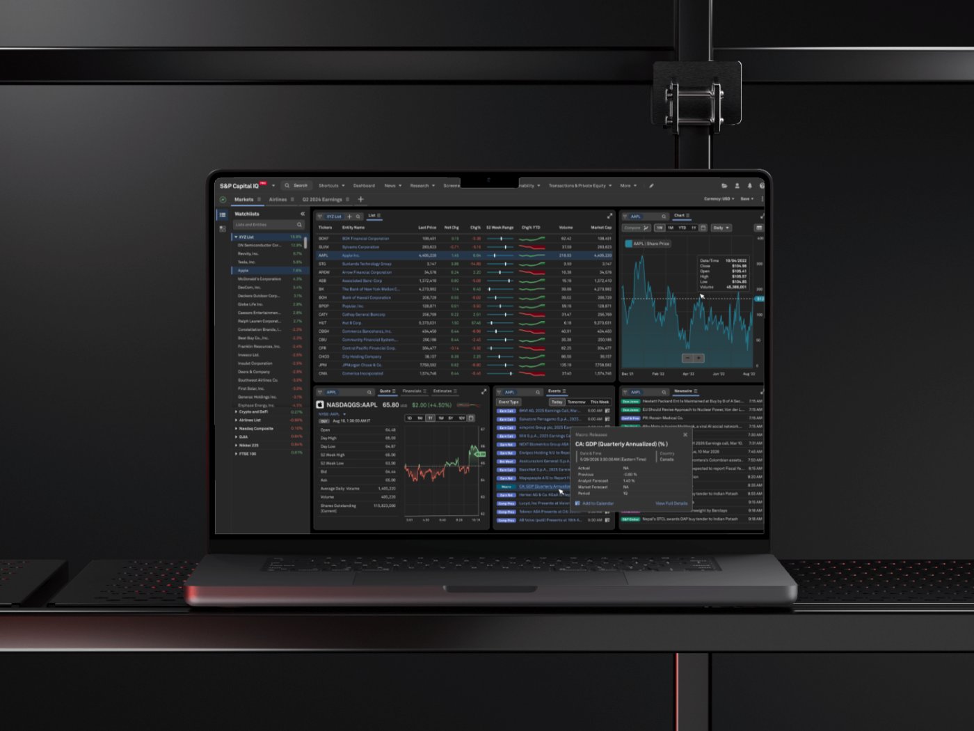
S&P Global: CIQ PRO Dashboard
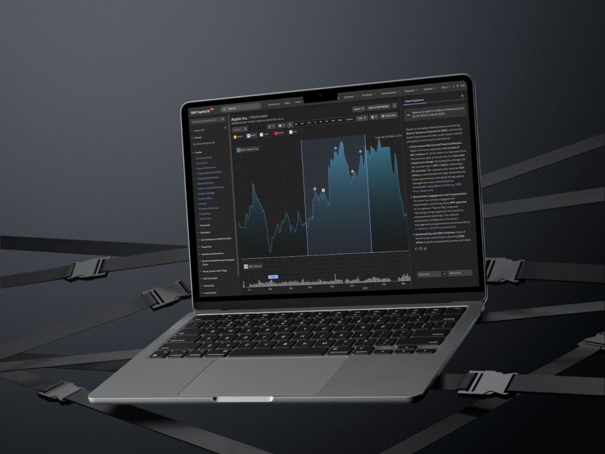
S&P Global: Chart Explainer
Vodafone Qatar: Agent Platform
Contact me
Let's work together
Have a project in mind, or just want to say hi? I'm always open to new conversations.