Etisalat: e&money
How I unified wallets, bills, cards, and remittance to 200+ countries into one app
Paying a bill, sending money home, and topping up a phone took three apps and a trip to an exchange house.
I led the end-to-end experience of the app and its services: wallet, remittance, bills, top-ups, cards, and rewards, through a full revamp while the live app kept shipping.
Role
Designer
Category
FinTech / Digital Wallet
Timeline
2023
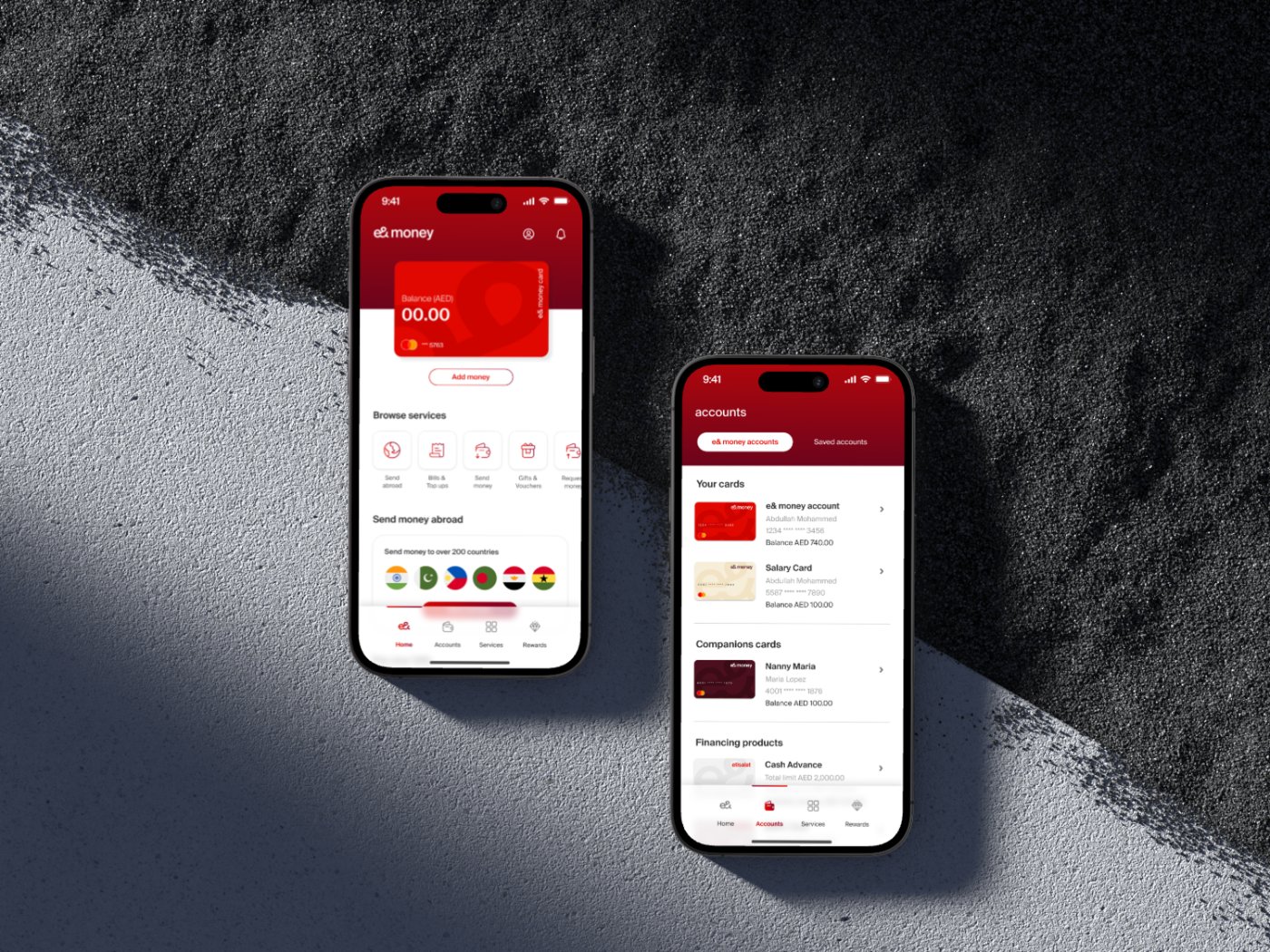
1 app
Wallet, cards & bills unified
Multi
Card & companion management
Rewards
Built-in loyalty program
AED
Native local money
“Everyday money in the UAE, finally in one confident app.”
Client feedback
Overview
The contexte& money is the first digital wallet licensed by the Central Bank of the UAE and the fintech arm of e& life, with the ambition of becoming a full financial super app marketplace, a single place to make purchases, pay utility bills, send money across 200+ countries, manage cards, donate, and much more.
I led the entire experience of the e& money app and its services: a complete revamp built on Design Thinking methodology, while simultaneously maintaining and improving the UX of the older version still in users' hands. The goal set by the business was ambitious: seamless, intuitive, and visually appealing interactions across all touch-points, with e& money serving as a benchmark in the fintech industry.
Challenge
The problemThe existing app was failing its users. Usability testing concluded that people found it challenging to navigate and were unable to perform different functions. For a licensed digital wallet handling money, that's an existential problem, every failed task is a transaction lost and trust eroded. Deeper pain points emerged from research and A/B testing:
Insecure, inconvenient transfers
Users found it challenging to securely and conveniently transfer money between accounts, causing inconvenience and potential security risks.
Missed bills and due dates
People struggled to keep up with bill payments and due dates, resulting in late payments, penalties, and negative credit impacts, with no automated reminders or bill management to help them stay organized.
No way to understand spending
Users found it hard to categorize and analyze their expenses, making budgeting and improvement nearly impossible.
A super app's scope
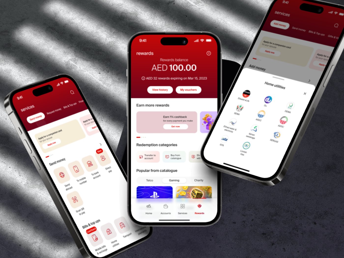
e& money spans wallets, cards, local and international transfers, bill payments, donations, bulk salary payments, rewards, gift stores, and gamification. Packing this breadth into one app without overwhelming users demanded a fundamental rethink of the information architecture.
Two apps at once
The revamp had to move forward while the older version continued serving live users, meaning the design work ran on two tracks simultaneously.
The core problem: rebuild a struggling wallet app into a navigable, trustworthy financial super app, without pausing the product for its existing users.
Approach
The processA discovery workshop to align everyone first
We began with a structured Design Thinking workshop with stakeholders: stakeholder interviews on business goals; assumption mapping to assess how desirable, viable, and feasible the product was; identifying users and their goals; mapping the experience end to end to streamline processes and minimize pain points; and a brain-dump ideation exercise for services, features, and business upselling.
Research with real users
I conducted user interviews covering motivations, comfort with digital payments, desired features, past e-wallet experiences, and security expectations. The insights were clear: users wanted convenience, speed, and security; easy fund transfers and multiple payment methods; transaction history tracking; an intuitive, customizable interface; and robust security, encryption, biometric authentication, and transaction monitoring, because their money was involved.
Aligning business goals with design goals
The team set clear goals for the redesign, aligning them with target-user needs and business objectives, then created wireframes, user flows, and prototypes, with iterative design reviews and user testing sessions improving the UI and navigation at every step.
Simplifying a complex information architecture
With so many services in one app, the IA was restructured so users could actually find relevant information and access every feature, up-fronting key features and reducing the number of steps to complete any process or reach an end goal.
Redesigning the full experience, end to end
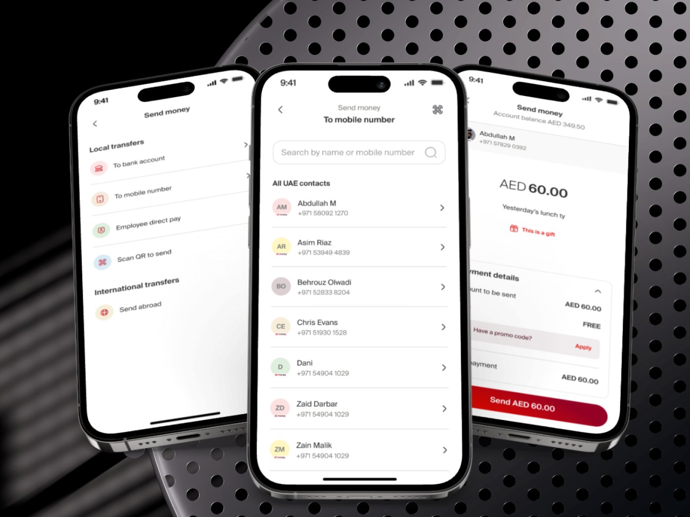
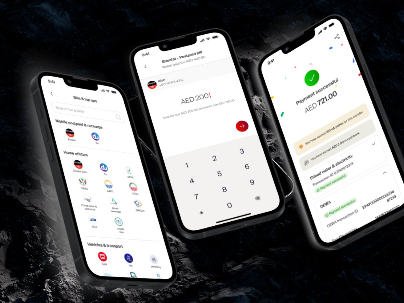
The revamp covered the complete journey in high fidelity: onboarding & KYC (Emirates ID capture, selfie video verification, and instant virtual-card issuance); accounts & cards (a unified view of e& money accounts, linked banks, saved and supplementary cards, and financing); payments & transfers (send money to 200+ countries, bills and top-ups, QR payments, request money); rewards & engagement (cashback, redemption catalogue, gift store, and gamified cash envelopes); financial wellness (monthly spending analysis for expense categorization); and a content strategy that educates users throughout to build trust.
Continuous feedback, delivered in phases
The project ran in 4 iterative phases, each closing with client and product-owner meetings, deliverable presentations, hand-off revisions, and planning for upcoming services, with updates prioritized on user feedback and business priorities, in close collaboration with developers to ensure a high-quality build.
Outcome
The resultA complete revamp of a licensed digital wallet, from a struggling app users couldn't navigate to a coherent financial super app:
A coherent financial super app
spanning payments, transfers, cards, rewards, donations, and financial management.
User-centric design that educates
guiding users through the product and highlighting key details to instill confidence and trust.
A simplified information architecture
users can find information and access all features and services, with key features up-fronted.
Reduced friction across every journey
fewer steps to complete transfers and bill payments, directly addressing the failures uncovered in usability testing.
Research pain points turned into features
spending analysis and streamlined bill flows answer the exact problems users reported.
A cohesive visual design and design system
visually engaging, consistent experiences across all touch-points.
Continuity for existing users
the older version's UX was maintained and improved in parallel, so no user was left behind.
The revamp positioned e& money to do what the business set out to achieve: serve as a benchmark experience in the fintech industry.
Key learnings
What I took awayDesign Thinking scales to scope, a structured discovery workshop kept a sprawling super app coherent.
Trust is a design material, biometrics, clear states, and in-context education did as much as features.
Ship without pausing, running the new design alongside the live app proved continuity beats a hard cutover.
Research pain points are your roadmap, spending analysis and bill flows came straight from user interviews.
More projects

S&P Global: CIQ PRO Dashboard
S&P Global: Chart Explainer
Vodafone Qatar: Agent Platform
Contact me
Let's work together
Have a project in mind, or just want to say hi? I'm always open to new conversations.