Allied Bank: myABL
How I revamped a banking app used by 1M+ people on an atomic design system built to scale
You can't take a banking app offline to redesign it. A million people are using it today.
One of three designers. I built the atomic design system foundations and component library, and designed the core money-movement journeys.
Role
Product Designer
Category
Digital Banking
Timeline
2023 to 2024
1M+
App downloads (iOS + Android)
1
Unified atomic design system
Dozens
Core flows unified
3
Designers on the team
“Banking in the palm of a million hands, modern, consistent, and built to scale.”
Client feedback
Overview
The contextAllied Bank Limited is one of the largest banks in Pakistan and a pioneer of the country's digital banking landscape. Its mobile app, myABL, is the bank in millions of pockets, with over 1 million downloads and more than 17 million transactions processed through the app every year.
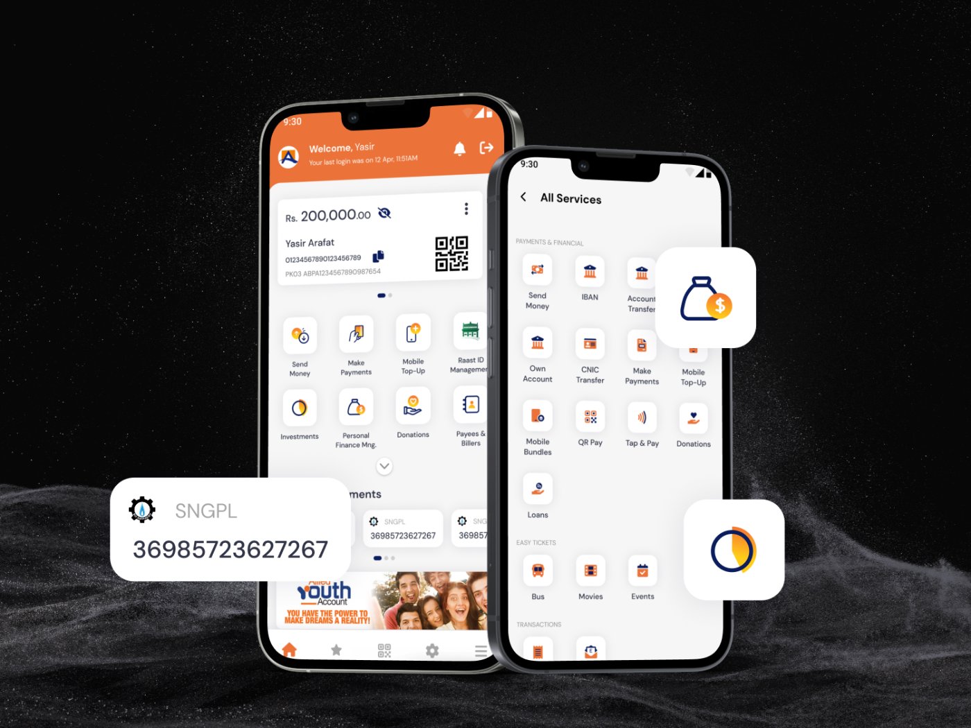
At that scale, every design decision matters. This project was a full UX/UI revamp of the existing application: modernizing the experience across the app's core journeys, from sending money and paying bills to managing cards, budgeting, and locating branches, all built on a new, scalable design system. My key contributions were the design system and visual design.
Challenge
The problemRevamping a live banking app used by over a million people comes with a distinct set of challenges:
Scale and trust
With 17 million+ transactions a year, the app handles people's money every day. The redesign had to modernize the experience without ever compromising the clarity and trust users need when moving their funds.
Breadth of features
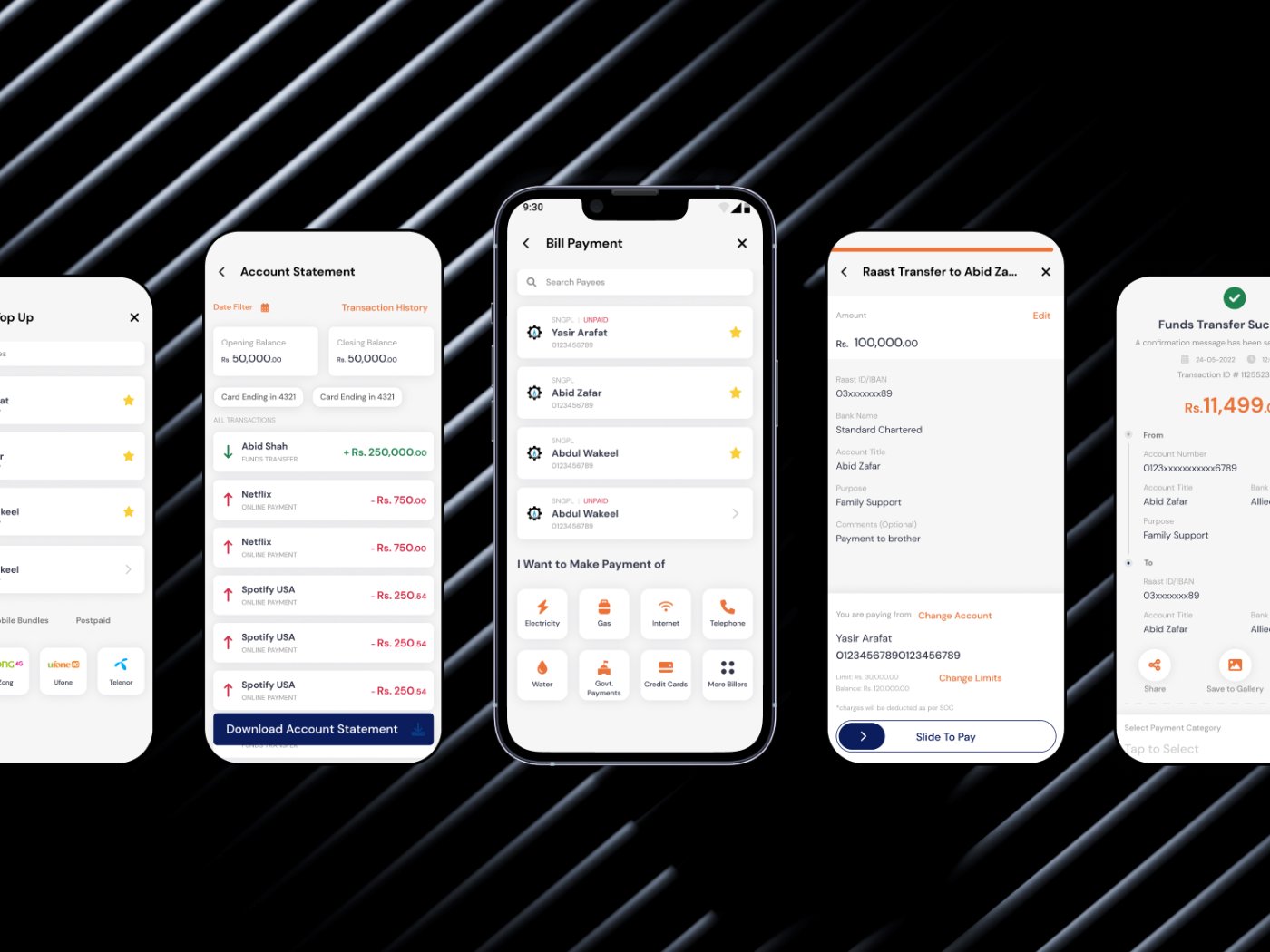
myABL spans transfers (IBAN, bank transfer, Raast), bill payments, card management, Tap & Pay, personal finance, budgeting, investments, loans, donations, tickets, and branch location, dozens of flows that all needed to feel like one coherent product.
Consistency without a foundation
The app had grown feature by feature over the years. Without a unified design language, screens diverged in styling and interaction patterns, making the experience inconsistent and every new feature slower to design and build.
The core problem: a feature-rich, high-traffic banking app needed a modern, unified experience, and a design foundation that could scale with it.
Approach
The processAn atomic design system as the backbone
The team chose an atomic design system for its scalability, modularity, and efficiency. I defined the system's foundations and components, so every screen in the revamp, and every future feature, could be assembled from consistent, reusable parts.
Foundations: color, type, spacing, grid, iconography
A palette built around ABL's brand, a deep primary blue and vibrant orange, with a structured neutral scale and full semantic sets (success, fail, warning, info). A 12-32px type scale for dense financial data, a 4px spacing scale on a 16px grid, and a unified icon set covering dozens of services.
A full component library
Headers, navigation, primary/secondary/text buttons with active and inactive states, inputs, toggles, checkboxes, radios, modals, toasts for every semantic state, and payee cards, each designed once, with all its states, and reused across the app.
High-fidelity design across core journeys
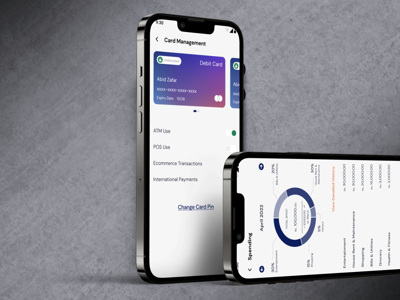
With the system in place, we designed the key flows end to end: dashboard, onboarding and biometric login, send money (IBAN, Raast, CNIC, own account) with OTP and shareable receipts, bill payments, card management and Tap & Pay, personal finance and budgeting, limit management, and branch locator.
Interactive prototyping
We connected screens and flows into an interactive prototype, giving stakeholders a tangible understanding of how users navigate the app, before development began.
Outcome
The resultThe revamp modernized one of Pakistan's major digital banking apps across its full breadth of features:
A complete UX/UI revamp spanning payments, transfers, cards, budgeting, and more.
A scalable atomic design system
color, typography, spacing, grids, iconography, and a full component library, giving ABL a foundation for faster, more consistent design and development.
Coherence at scale
dozens of distinct flows now share one visual language, one set of interaction patterns, and one clear hierarchy.
Clarity where it matters most
semantic colors, structured confirmations, OTP steps, and readable receipts keep users confident at every step of a transaction.
Stakeholder alignment through prototyping
interactive flows made the experience reviewable before a line of code was written.
Designed for an app serving 1 million+ users and 17 million+ transactions a year, this revamp brought the bank to the palms of its users, with a design foundation built to grow.
Key learnings
What I took awayAtomic systems make banking scale, foundations first, then flows, kept 1M+ users consistent.
Trust lives in the details, moving money needs unambiguous states and constant feedback.
Prototype before you build, an interactive prototype de-risked dozens of core journeys early.
Revamp respectfully, modernizing a beloved app means evolving patterns users already trust.
More projects
S&P Global: CIQ PRO Dashboard
S&P Global: Chart Explainer
Vodafone Qatar: Agent Platform
Contact me
Let's work together
Have a project in mind, or just want to say hi? I'm always open to new conversations.